Introduction
During the Covid-19 pandemic, discussions often centered on the weaknesses of the US medical system, particularly the shortage of hospital beds, physicians, and healthcare expenditures. This analysis aims to explore the relationship between the death rate and the availability of beds, physicians, and health expenditures across different states. Understanding these relationships can help identify areas for improvement and ensure better preparedness for future healthcare crises.
This section provides an exploratory analysis of the data to investigate whether a significant relationship exists between the death rate per 100,000 residents and the three variables: beds per 1,000 residents, physicians per 1,000 residents, and health expenditure per capita. Scatter plots are used to visually inspect these relationships before performing a detailed regression analysis.
Data Overview
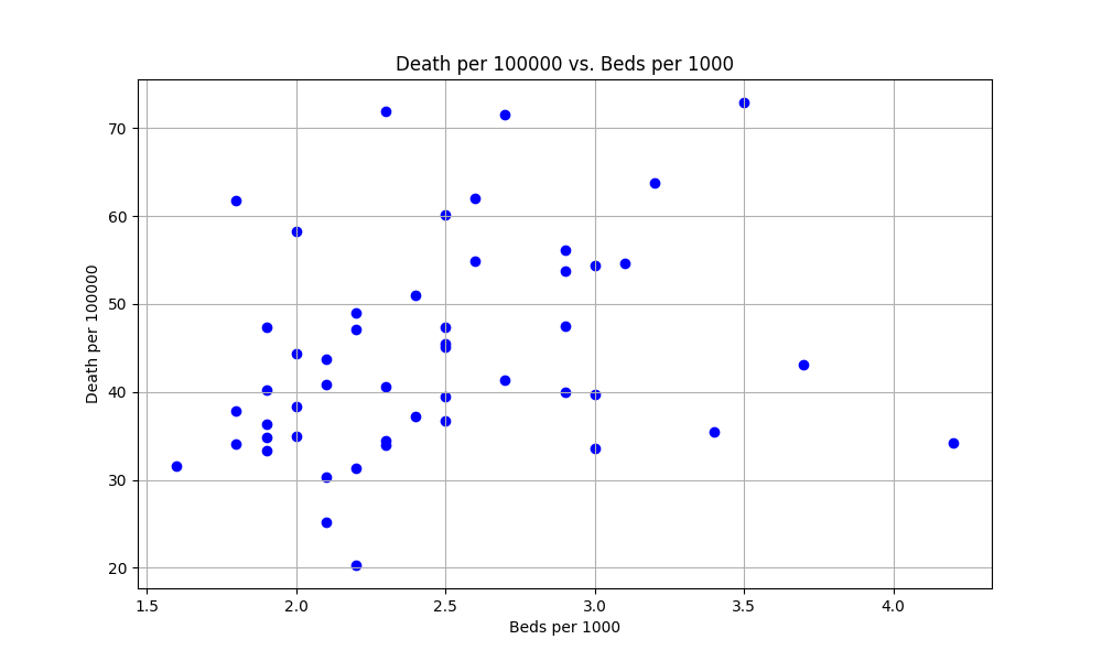
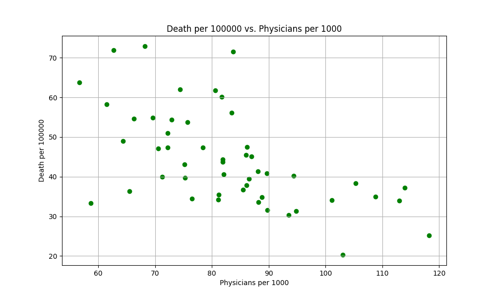
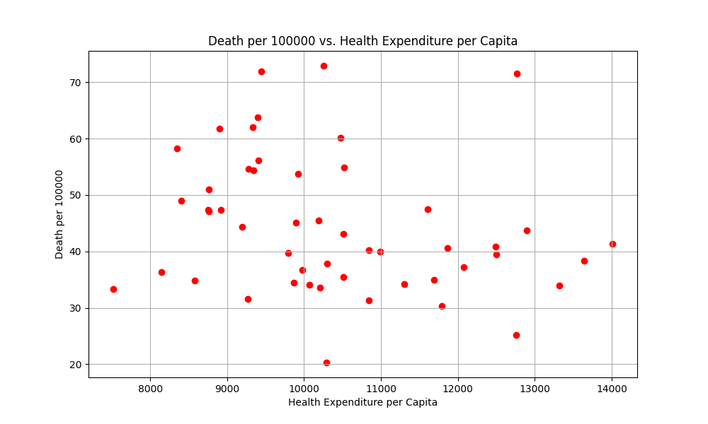
The scatter plots above show the relationships between the death rate per 100,000 residents and each of the three variables. From these plots, it is evident that no clear trend can be observed, indicating that a single-variable regression might not be sufficient. Therefore, a multilinear regression analysis will be conducted using all three variables.
Multilinear Regression Analysis
Regression Results for All Three Variables
Analysis:
- Beds per 1000: The coefficient is not statistically significant, suggesting that the number of beds per 1000 residents does not have a significant impact on the death rate.
- Health expenditure per capita: The coefficient is also not statistically significant, indicating that health expenditure per capita does not have a significant impact on the death rate.
- Physicians per 1000: The coefficient is statistically significant, indicating that an increase in the number of physicians per 1000 residents is associated with a decrease in the death rate.
Regression Results for Two Variables
Analysis:
- Health expenditure per capita: The coefficient is not statistically significant, suggesting that health expenditure per capita does not have a significant impact on the death rate.
- Physicians per 1000: The coefficient remains statistically significant, indicating that an increase in the number of physicians per 1000 residents is associated with a decrease in the death rate.
Final Equation
The final regression equation is given by:
death per 100000 = 76.5784 + 0.0019 * health expenditure per capita - 0.6299 * physicians per 1000Interpretation:
- Constant (76.5784): The baseline death rate per 100,000 residents when the other variables are zero.
- Health expenditure per capita (0.0019): An increase of $1 in health expenditure per capita is associated with an increase of 0.0019 in the death rate per 100,000 residents, though this relationship is not statistically significant.
- Physicians per 1000 (-0.6299): An increase of one physician per 1,000 residents is associated with a decrease of 0.6299 in the death rate per 100,000 residents.
3D Scatter Plot with Regression Plane
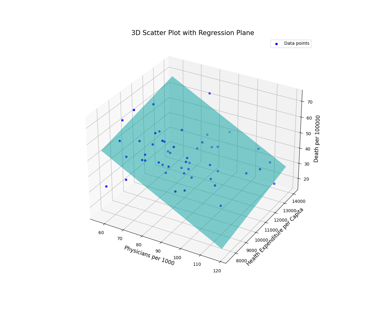
The 3D scatter plot above visually demonstrates the relationship between the death rate per 100,000 residents and the two significant variables: physicians per 1,000 residents and health expenditure per capita. The regression plane highlights the trend identified in the data. Specifically, we can observe that:
- As the number of physicians per 1,000 residents increases, the death rate tends to decrease, which is consistent with the negative coefficient found in the regression analysis.
- The effect of health expenditure per capita is less clear, as the coefficient was not statistically significant in our regression model. This indicates that variations in health expenditure per capita do not consistently correlate with changes in the death rate across different states.